What is Split‑Toning art style?
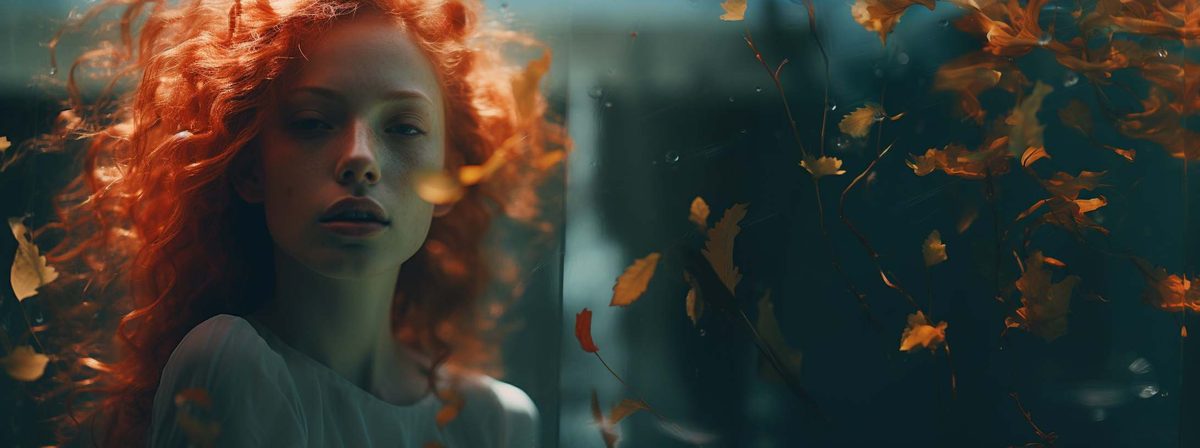
Applying different colours to a photo's shadows and highlights for stylised colour grading.
Applying different colours to a photo's shadows and highlights for stylised colour grading.
split‑toning, teal shadows, warm highlights, dual‑colour grade, cinematic colour palette
Trivia: The classic 'teal and orange' look dominates modern film posters.
Applying different colours to a photo's shadows and highlights for stylised colour grading.
Start with your subject, then add the style phrase below to guide the look of the image more precisely.
split‑toning, teal shadows, warm highlights, dual‑colour grade, cinematic colour palette
Applying different colours to a photo's shadows and highlights for stylised colour grading.
Start with your subject, then add these style keywords: split‑toning, teal shadows, warm highlights, dual‑colour grade, cinematic colour palette.
Split‑Toning works well when you want the image to inherit the visual language of photography references while keeping a clear, recognizable look.